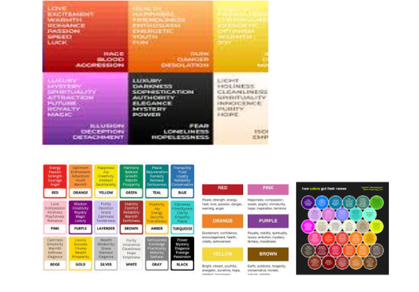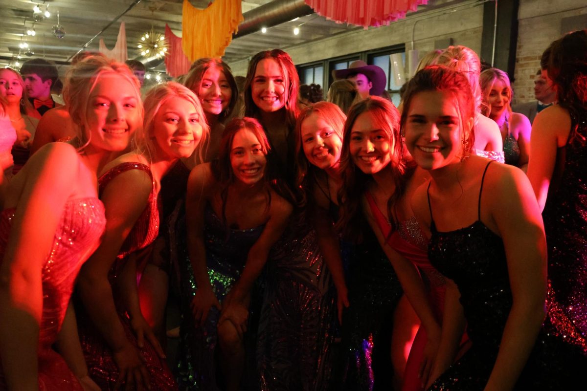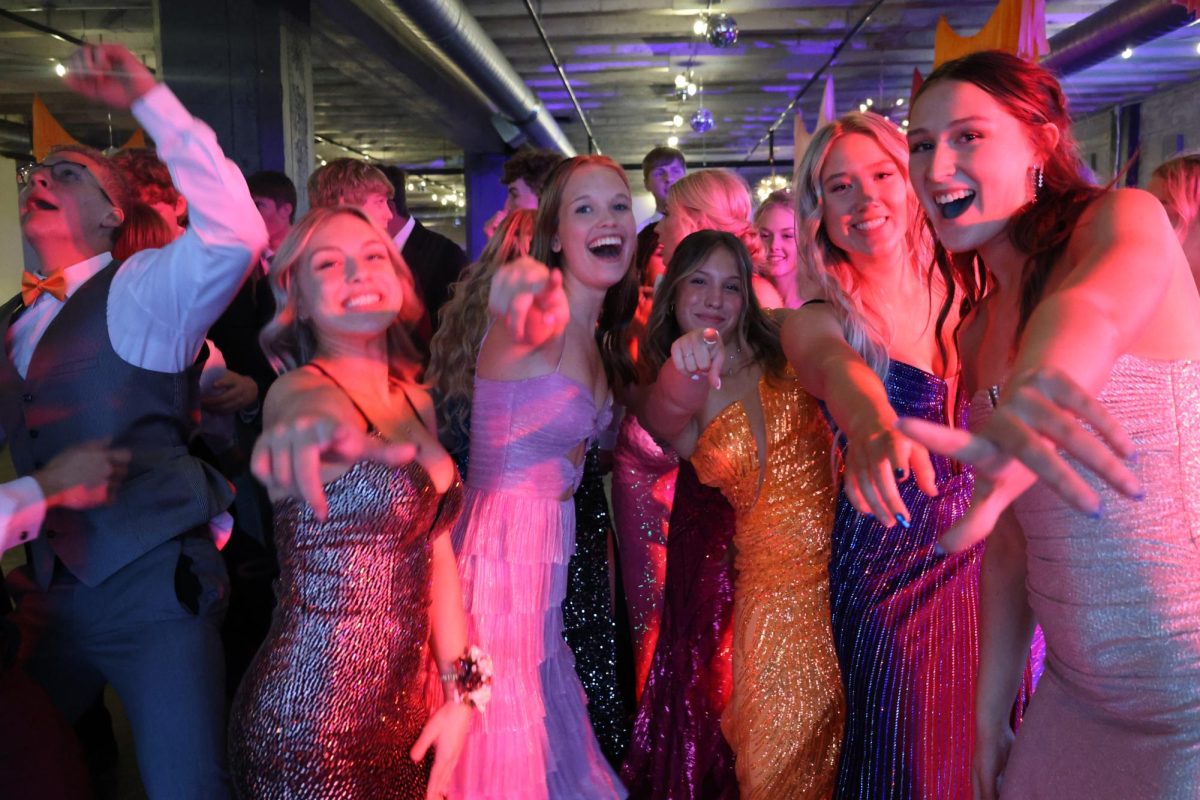


Colors make up the composition of all things in life, yet many people often overlook the emotional and mental connotations of colors. Colors have meanings behind them, and learning those meanings is a way of better understanding the colors themselves.
Red, one of three primary colors, is seen as a very hot color. It’s associated with fire, violence, and warfare, but it’s also associated with love and passion. In history, it’s been associated with both the Devil and Cupid. Colors can have a physical effect on people, and red is just the same, as it has contributed to raising blood pressure and respiration rates. It’s been shown to enhance human metabolism, too. Red can also be associated with importance, namely the red carpet at awards shows and celebrity events. Red indicates danger, the reason stop lights and signs are red, and that warning labels are often red.
Yellow, another primary color, is often considered the brightest and most energizing of the warm colors. It’s associated with happiness and sunshine. Yellow can also be associated with deceit and cowardice, though, such as calling someone yellow is calling them a coward. Yellow is also associated with hope, as can be seen in some countries when yellow ribbons are displayed by families who have loved ones at war. Yellow is also associated with danger, though not as strongly as red.
Orange, a secondary color and the product of red and yellow is a very vibrant and energetic color. In its muted forms, it can be associated with the earth and autumn. Because of its association with the changing seasons, oranges can represent change and movement in general. Orange is also strongly associated with creativity. In designs, orange commands attention without being as overpowering as red. It’s often considered more friendly and inviting, and less in–your–face.
Green on the other hand is a very down–to–earth color. It can represent new beginnings and growth. It also signifies renewal and abundance. Alternatively, green can also represent envy, jealousy, and lack of experience. Green has many of the same calming attributes that blue has, but it also incorporates some of the energy of yellow. In design, green can have a balancing and harmonizing effect, and is very stable.
Blue on the other hand is often associated with sadness in the English language. Blue is also used extensively to represent calmness and responsibility. Light blues can be refreshing and friendly. Dark blues are more strong and reliable. Blue is also associated with peace and has spiritual and religious connotations in many cultures and traditions. For example, the Virgin Mary is generally depicted wearing blue robes.
Dark purple, throughout history, has most prominently been associated with royalty and wealth, primarily because purple dyes were among the rarest and most expensive. Meanwhile, lighter purples like lavender are considered more romantic. In ancient times, the dyes used for creating purple hues were extracted from snails and were very expensive, so only royals and the wealthy could afford them. Purple is a combination of red and blue and takes on some attributes of both. It’s associated with creativity and imagination, too. In Thailand, In design, dark purples can give a sense of wealth and luxury